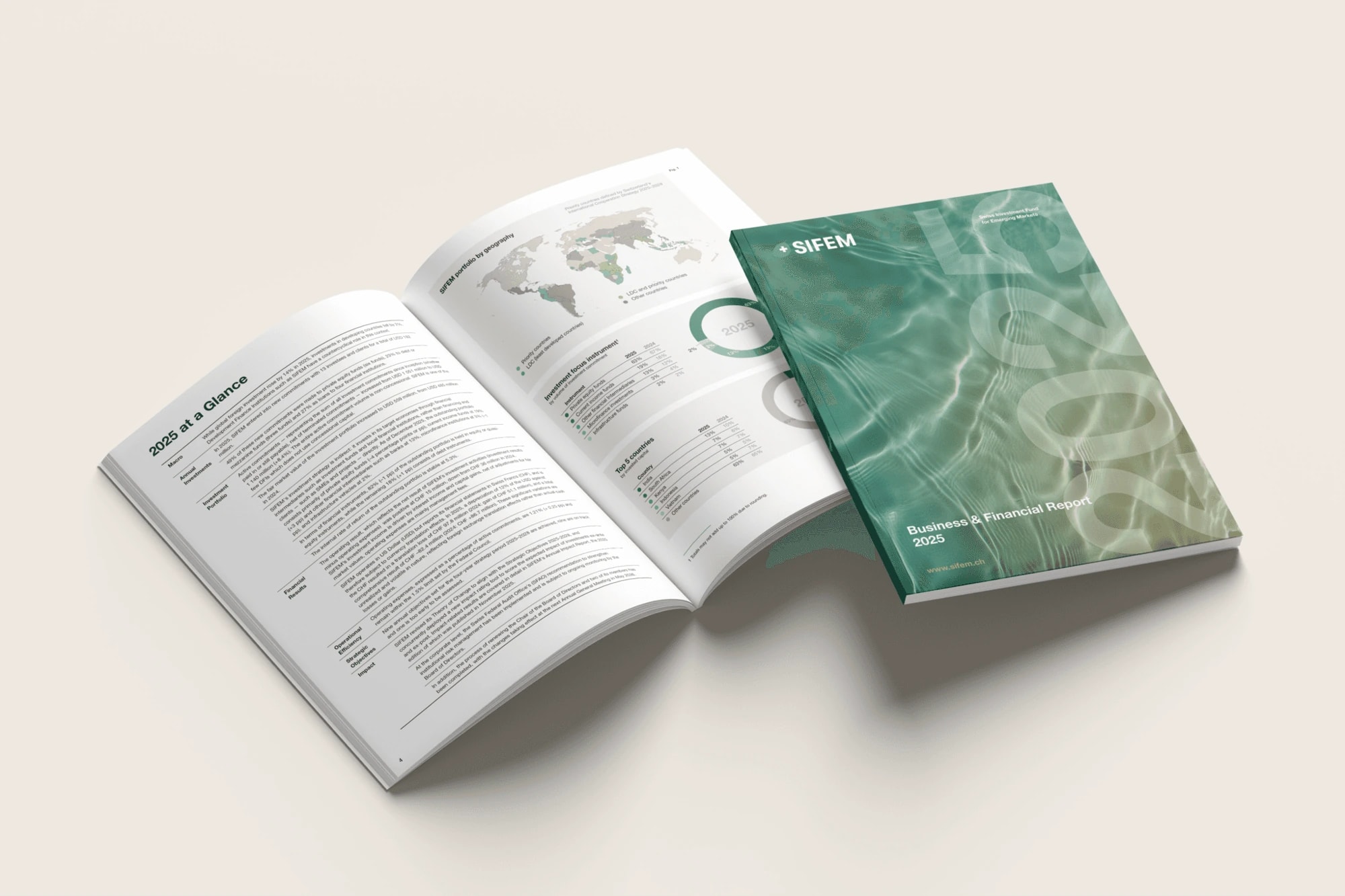
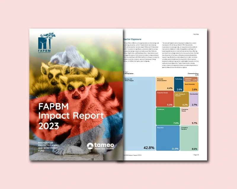
The design work at Geneva Management Group addressed those differences within a consistent visual language. Typography, charts and imagery gave detailed financial content a clear structure across publications, presentations and social media.
A sequence for the conversation
Fund materials and a real-estate credentials deck organised key figures, charts and service descriptions into a sequence that could support a meeting or be read independently. A common grid separated the overview from supporting detail.
Navy, pale blue and white backgrounds, with restrained red accents, gave the presentations a recognisable rhythm. In the Investment Outlook, that hierarchy extended to text columns, pull quotes and charts, with a distinct cover setting the publication’s tone.
A shorter format, the same discipline
Social carousels translated investment themes and webinar material into individual points. Each slide carried one idea, using a headline, a short explanation and an image or chart to move the sequence forward.
Editorial quotations and more expressive imagery could sit within the same series because typography and recurring brand elements provided continuity. The format changed; the organisation’s visual voice remained recognisable.