Samuel Davies redesigned the journal’s printed layout, establishing a consistent typographic and editorial structure across successive issues.
A recognisable cover, space for each issue
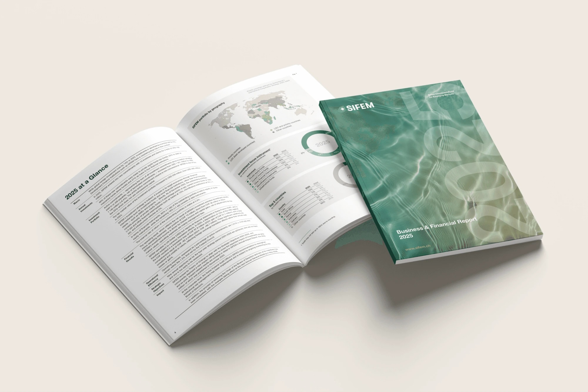
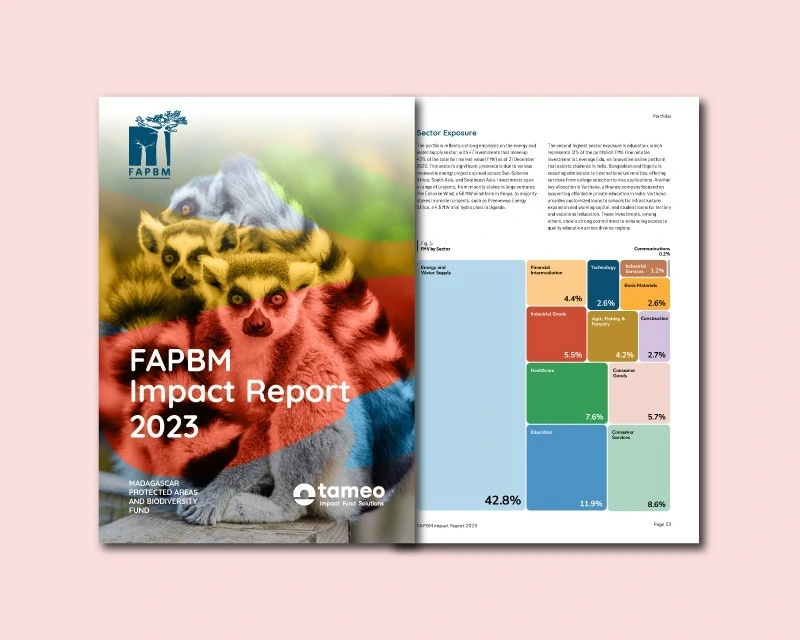
Photography gives the covers their focal point, supported by a prominent title and a clear hierarchy for the edition details. Different images and accent colours allow each issue to have its own character within a recurring format.
Clarity through the inside pages
A column-based grid brings order to articles, notices and community updates. Headings, typographic contrast and restrained colour accents distinguish sections and help readers move between longer texts and shorter items.
The redesign carries a consistent visual rhythm from cover to interior, while accommodating the variety of material that a community journal needs to publish.